Bem-vindo à seção Novas Fontes — onde você descobre os lançamentos mais recentes adicionados ao FFonts.net. Seja designer, desenvolvedor ou amante da tipografia, esta página ajuda você a acompanhar as novidades do design.
Cada nova fonte tem sua própria personalidade: de sans-serifs modernas e limpas a scripts expressivas e displays ousadas. Atualizamos esta lista frequentemente para que você possa visualizar e baixar gratuitamente as últimas criações.
-
( Fonts by Bexxtype - Personal-use only. For commercial use please contact owner. )
An elegant, flowing script font with whimsical loops and dynamic forms.
 Baixar 37 baixar@WebFont
 -
( Fonts by Bexxtype - Personal-use only. For commercial use please contact owner. )
An elegant script font with flowing, cursive strokes and refined details.
![Undella baixar fontes gratis]() Baixar 43 baixar@WebFont
Baixar 43 baixar@WebFont -
( Fonts by Bexxtype - Personal-use only. For commercial use please contact owner. )
An elegant script font with intricate swashes and decorative flourishes.
![Hypatia baixar fontes gratis]() Baixar 40 baixar@WebFont
Baixar 40 baixar@WebFont -
( Fonts by Bexxtype - Personal-use only. For commercial use please contact owner. )
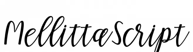
A lively and elegant script font with fluid, cursive strokes.
![MellittaScript baixar fontes gratis]() Baixar 36 baixar@WebFont
Baixar 36 baixar@WebFont -
( Fonts by Bexxtype - Personal-use only. For commercial use please contact owner. )
A bold, flowing script font with elegant, connected letterforms.
![Richardine baixar fontes gratis]() Baixar 59 baixar@WebFont
Baixar 59 baixar@WebFont -
( Fonts by Bexxtype - Personal-use only. For commercial use please contact owner. )
An elegant, flowing script font with ornate uppercase and graceful lowercase letters.
![ningsih baixar fontes gratis]() Baixar 34 baixar@WebFont
Baixar 34 baixar@WebFont -
( Fonts by Bexxtype - Personal-use only. For commercial use please contact owner. )
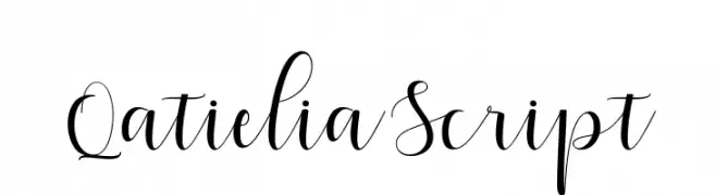
An elegant, flowing script font with high contrast and sophisticated style.
![QatieliaScript baixar fontes gratis]() Baixar 47 baixar@WebFont
Baixar 47 baixar@WebFont -
( Fonts by Bexxtype - Personal-use only. For commercial use please contact owner. )
A dynamic and elegant script font with flowing, cursive letterforms.
![Elistabeta baixar fontes gratis]() Baixar 38 baixar@WebFont
Baixar 38 baixar@WebFont -
( Fonts by Bexxtype - Personal-use only. For commercial use please contact owner. )
A flowing, cursive script font with elegant, interconnected characters.
![feedback baixar fontes gratis]() Baixar 46 baixar@WebFont
Baixar 46 baixar@WebFont -
( Fonts by Bexxtype - Personal-use only. For commercial use please contact owner. )
An elegant, flowing script font with graceful, cursive letterforms.
![HaertbelScript baixar fontes gratis]() Baixar 43 baixar@WebFont
Baixar 43 baixar@WebFont -
( Fonts by Bexxtype - Personal-use only. For commercial use please contact owner. )
A sophisticated script font with elegant, flowing cursive strokes.
![chetlie baixar fontes gratis]() Baixar 43 baixar@WebFont
Baixar 43 baixar@WebFont -
( Fonts by Bexxtype - Personal-use only. For commercial use please contact owner. )
A stylish and elegant script font with flowing, connected letterforms.
![flashlight baixar fontes gratis]() Baixar 37 baixar@WebFont
Baixar 37 baixar@WebFont -
( Fonts by Bexxtype - Personal-use only. For commercial use please contact owner. )
A playful, decorative script font with looping, interconnected strokes.
![TheRevolution baixar fontes gratis]() Baixar 57 baixar@WebFont
Baixar 57 baixar@WebFont -
( Fonts by Bexxtype - Personal-use only. For commercial use please contact owner. )
An elegant script font with flowing, ornate cursive letters and high contrast strokes.
![Fantastic-Italic baixar fontes gratis]() Baixar 51 baixar@WebFont
Baixar 51 baixar@WebFont -
( Fonts by Betwixt Designs - Personal-use only. For commercial use please contact owner. )
A bold, flowing script font with a modern and energetic style.
![BTX Radiant Sunshine baixar fontes gratis]() Baixar 85 baixar@WebFont
Baixar 85 baixar@WebFont -
( Fonts by Betwixt Designs - Personal-use only. For commercial use please contact owner. )
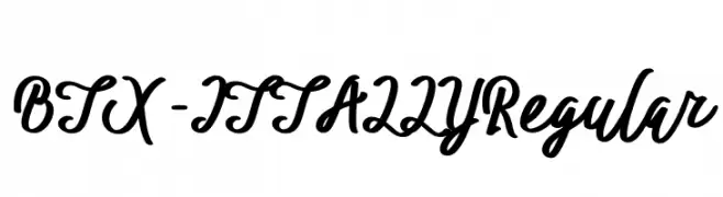
A flowing, cursive script font with elegant loops and a handwritten style.
![BTX-ITTALLY Regular baixar fontes gratis]() Baixar 44 baixar@WebFont
Baixar 44 baixar@WebFont -
( Fonts by Betty Zhang - Personal-use only. For commercial use please contact owner. )
A bold, striped font with a modern and geometric design.
![Stripes Regular baixar fontes gratis]() Baixar 47 baixar@WebFont
Baixar 47 baixar@WebFont -
( Fonts by Beth Nott - Personal-use only. For commercial use please contact owner. )
A bold, playful handwritten font with thick, rounded strokes.
![Handwriting baixar fontes gratis]() Baixar 31 baixar@WebFont
Baixar 31 baixar@WebFont -
( Fonts by Best Font Studio - Rifan Asri - Personal-use only. For commercial use please contact owner. )
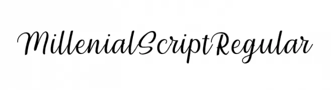
A graceful and elegant script font with a handwritten feel.
![Millenial Script Regular baixar fontes gratis]() Baixar 50 baixar@WebFont
Baixar 50 baixar@WebFont -
( Fonts by Best Font Studio - Rifan Asri - Personal-use only. For commercial use please contact owner. )
A bold, expressive brush-style font with a hand-painted look.
![ShowetyBrush baixar fontes gratis]() Baixar 34 baixar@WebFont
Baixar 34 baixar@WebFont -
( Fonts by Best Font Studio - Rifan Asri - Personal-use only. For commercial use please contact owner. )
An elegant, flowing script font with graceful curves and moderate contrast.
![inthai-Regular baixar fontes gratis]() Baixar 34 baixar@WebFont
Baixar 34 baixar@WebFont -
( Fonts by Best Font Studio - Rifan Asri - Personal-use only. For commercial use please contact owner. )
A modern, elegant script font with graceful loops and artistic flourishes.
![mahligai baixar fontes gratis]() Baixar 34 baixar@WebFont
Baixar 34 baixar@WebFont -
( Fonts by Best Font Studio - Rifan Asri - Personal-use only. For commercial use please contact owner. )
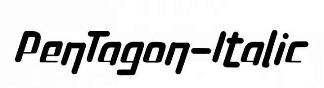
A bold, modern italic font with dynamic and energetic strokes.
![PenTagon-Italic baixar fontes gratis]() Baixar 56 baixar@WebFont
Baixar 56 baixar@WebFont -
( Fonts by Best Font Studio - Rifan Asri - Personal-use only. For commercial use please contact owner. )
A playful and flowing script font with smooth curves and elegant loops.
![jellyfish-Regular baixar fontes gratis]() Baixar 51 baixar@WebFont
Baixar 51 baixar@WebFont -
( Fonts by Best Font Studio - Rifan Asri - Personal-use only. For commercial use please contact owner. )
A playful and elegant script font with smooth, flowing curves.
![flashback baixar fontes gratis]() Baixar 44 baixar@WebFont
Baixar 44 baixar@WebFont -
( Fonts by Best Font Studio - Rifan Asri - Personal-use only. For commercial use please contact owner. )
A lively and flowing script font with elegant, cursive letterforms.
![kallithea Regular baixar fontes gratis]() Baixar 57 baixar@WebFont
Baixar 57 baixar@WebFont -
( Fonts by Best Font Studio - Rifan Asri - Personal-use only. For commercial use please contact owner. )
A graceful script font with fluid, connected strokes and elegant flourishes.
![chillout-script baixar fontes gratis]() Baixar 58 baixar@WebFont
Baixar 58 baixar@WebFont -
( Fonts by Best Font Studio - Rifan Asri - Personal-use only. For commercial use please contact owner. )
A refined, slanted script font with elegant, flowing cursive strokes.
![Cantona Slant Slant baixar fontes gratis]() Baixar 41 baixar@WebFont
Baixar 41 baixar@WebFont -
( Fonts by Best Font Studio - Rifan Asri - Personal-use only. For commercial use please contact owner. )
A bold, brush-style font with a handcrafted, textured appearance.
![Khasanah Brush baixar fontes gratis]() Baixar 57 baixar@WebFont
Baixar 57 baixar@WebFont -
( Fonts by Best Font Studio - Rifan Asri - Personal-use only. For commercial use please contact owner. )
A playful and dynamic script font with a handwritten feel.
![jandle Regular baixar fontes gratis]() Baixar 4576 baixar@WebFont
Baixar 4576 baixar@WebFont -
( Fonts by Best Font Studio - Rifan Asri - Personal-use only. For commercial use please contact owner. )
A playful, handwritten font with rounded, slightly irregular letterforms.
![Hellowen Regular baixar fontes gratis]() Baixar 52 baixar@WebFont
Baixar 52 baixar@WebFont -
( Fonts by BessAsher Rebel - Bess Rebel - Personal-use only. For commercial use please contact owner. )
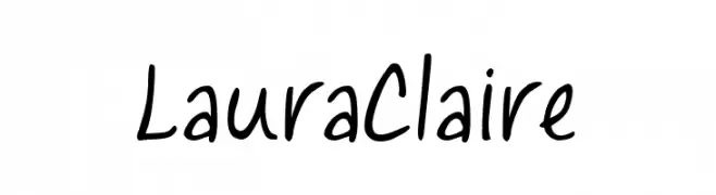
A playful, casual handwritten font with smooth, flowing lines.
![Laura Claire baixar fontes gratis]() Baixar 65 baixar@WebFont
Baixar 65 baixar@WebFont -
( Fonts by Bens Creative - Sihab Sihabudin - Personal-use only. For commercial use please contact owner. )
An elegant script font with flowing, cursive letterforms and sophisticated flourishes.
![Delberg baixar fontes gratis]() Baixar 59 baixar@WebFont
Baixar 59 baixar@WebFont -
( Fonts by Benoît Sjöholm - Personal-use only. For commercial use please contact owner. )
A modern, geometric font with rounded edges and uniform stroke width.
![Sophie baixar fontes gratis]() Baixar 89 baixar@WebFont
Baixar 89 baixar@WebFont -
( Fonts by Benditos Creative - Personal-use only. For commercial use please contact owner. )
A lively, expressive script font with bold, flowing strokes.
![desmonthe baixar fontes gratis]() Baixar 60 baixar@WebFont
Baixar 60 baixar@WebFont


Perguntas Frequentes – Novas Fontes
Qual é a nova fonte que todo mundo está usando?
As tendências mudam rápido, mas fontes sans-serif minimalistas e displays expressivas estão dominando. São perfeitas para conteúdo digital e identidade de marca moderna.
Quais são as cinco novas fontes populares?
As mais baixadas atualmente incluem Poppins, Roboto, Montserrat, Open Sans e Lato. Elas equilibram clareza e personalidade, ideais para marcas, editoriais e redes sociais.
Como testar antes de baixar?
Use o recurso de visualização: digite seu texto na página da fonte para testar peso, espaçamento e legibilidade em diferentes tamanhos. Quando estiver satisfeito, baixe o arquivo TTF/OTF.