Bem-vindo à seção Novas Fontes — onde você descobre os lançamentos mais recentes adicionados ao FFonts.net. Seja designer, desenvolvedor ou amante da tipografia, esta página ajuda você a acompanhar as novidades do design.
Cada nova fonte tem sua própria personalidade: de sans-serifs modernas e limpas a scripts expressivas e displays ousadas. Atualizamos esta lista frequentemente para que você possa visualizar e baixar gratuitamente as últimas criações.
-
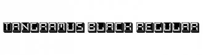
( Fonts by Vladimir Nikolic )
A bold, geometric font with a digital display style and high contrast.
 Baixar 30 baixar@WebFont
 -
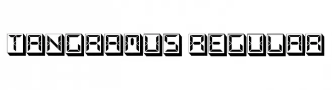
( Fonts by Vladimir Nikolic )
A bold, geometric 3D font with a futuristic and digital aesthetic.
![Tangramus Regular baixar fontes gratis]() Baixar 38 baixar@WebFont
Baixar 38 baixar@WebFont -
( Fonts by VinType )
A dot matrix style font with characters formed by small dots, offering a retro digital look.
![Many Dots Demo baixar fontes gratis]() Baixar 72 baixar@WebFont
Baixar 72 baixar@WebFont -
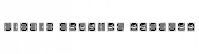
( Fonts by Vladimir Nikolic )
A futuristic, digital-style font with geometric and angular characters.
![Liquid Crystal Regular baixar fontes gratis]() Baixar 28 baixar@WebFont
Baixar 28 baixar@WebFont -
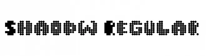
( Fonts by ShadowOnTheLoose )
A pixelated, retro-style font with a bold, blocky appearance.
![Shaodw Regular baixar fontes gratis]() Baixar 54 baixar@WebFont
Baixar 54 baixar@WebFont -
-
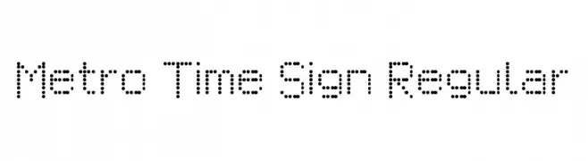
( Fonts by Chequered Ink )
A dot matrix style font with a digital, retro feel.
![Metro Time Sign Regular baixar fontes gratis]() Baixar 53 baixar@WebFont
Baixar 53 baixar@WebFont -
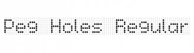
( Fonts by Chequered Ink )
A dot-based font with a pegboard aesthetic, offering a modern and playful look.
![Peg Holes Regular baixar fontes gratis]() Baixar 26 baixar@WebFont
Baixar 26 baixar@WebFont -
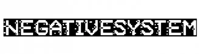
( Fonts by Woodcutter )
A pixelated, retro-style font with a digital, tech-inspired aesthetic.
![Negative System baixar fontes gratis]() Baixar 46 baixar@WebFont
Baixar 46 baixar@WebFont -
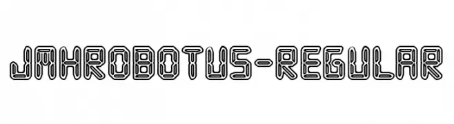
( Fonts by Jorge Morón )
A futuristic, geometric font with bold, outlined letters and a robotic appearance.
![JMHRobotus-Regular baixar fontes gratis]() Baixar 38 baixar@WebFont
Baixar 38 baixar@WebFont -
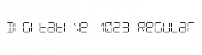
( Fonts by Voxi Denjay )
A digital, segmented font with a geometric, technical appearance.
![Digitative 1023 Regular baixar fontes gratis]() Baixar 32 baixar@WebFont
Baixar 32 baixar@WebFont

Perguntas Frequentes – Novas Fontes
Qual é a nova fonte que todo mundo está usando?
As tendências mudam rápido, mas fontes sans-serif minimalistas e displays expressivas estão dominando. São perfeitas para conteúdo digital e identidade de marca moderna.
Quais são as cinco novas fontes populares?
As mais baixadas atualmente incluem Poppins, Roboto, Montserrat, Open Sans e Lato. Elas equilibram clareza e personalidade, ideais para marcas, editoriais e redes sociais.
Como testar antes de baixar?
Use o recurso de visualização: digite seu texto na página da fonte para testar peso, espaçamento e legibilidade em diferentes tamanhos. Quando estiver satisfeito, baixe o arquivo TTF/OTF.