Bem-vindo à seção Novas Fontes — onde você descobre os lançamentos mais recentes adicionados ao FFonts.net. Seja designer, desenvolvedor ou amante da tipografia, esta página ajuda você a acompanhar as novidades do design.
Cada nova fonte tem sua própria personalidade: de sans-serifs modernas e limpas a scripts expressivas e displays ousadas. Atualizamos esta lista frequentemente para que você possa visualizar e baixar gratuitamente as últimas criações.
-
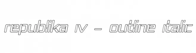
( Fonts by Apostrophic Lab )
A modern, geometric outline font with an italic slant, perfect for futuristic designs.
 Baixar 65 baixar@WebFont
 -
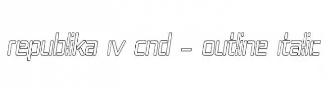
( Fonts by Apostrophic Lab )
A modern, geometric outline font with italicized, condensed characters.
![Republika IV Cnd - Outline Italic baixar fontes gratis]() Baixar 141 baixar@WebFont
Baixar 141 baixar@WebFont -
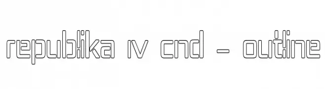
( Fonts by Apostrophic Lab )
A modern, geometric outline font with a condensed and cohesive design.
![Republika IV Cnd - Outline baixar fontes gratis]() Baixar 94 baixar@WebFont
Baixar 94 baixar@WebFont -
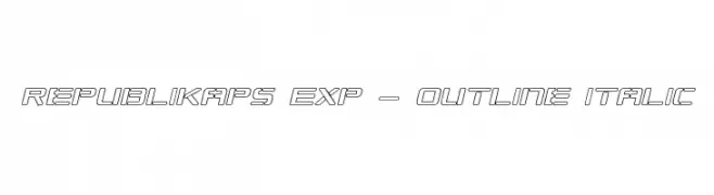
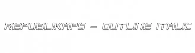
( Fonts by Apostrophic Lab )
A modern, geometric outline font with an italic slant and expanded width.
![Republikaps Exp - Outline Italic baixar fontes gratis]() Baixar 129 baixar@WebFont
Baixar 129 baixar@WebFont -
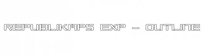
( Fonts by Apostrophic Lab )
A modern, geometric outline font with a futuristic aesthetic.
![Republikaps Exp - Outline baixar fontes gratis]() Baixar 176 baixar@WebFont
Baixar 176 baixar@WebFont -
-
( Fonts by Apostrophic Lab )
A modern, outlined italic font with a geometric and futuristic style.
![Republikaps - Outline Italic baixar fontes gratis]() Baixar 142 baixar@WebFont
Baixar 142 baixar@WebFont -
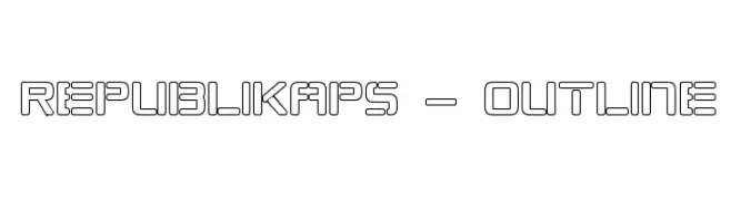
( Fonts by Apostrophic Lab )
A bold, geometric outline font with a modern, futuristic style.
![Republikaps - Outline baixar fontes gratis]() Baixar 139 baixar@WebFont
Baixar 139 baixar@WebFont -
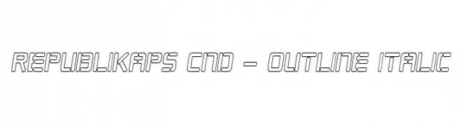
( Fonts by Apostrophic Lab )
A modern, italicized outline font with a condensed and geometric style.
![Republikaps Cnd - Outline Italic baixar fontes gratis]() Baixar 118 baixar@WebFont
Baixar 118 baixar@WebFont -
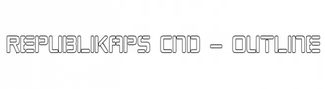
( Fonts by Apostrophic Lab )
A modern, geometric outline font with a futuristic aesthetic.
![Republikaps Cnd - Outline baixar fontes gratis]() Baixar 121 baixar@WebFont
Baixar 121 baixar@WebFont -
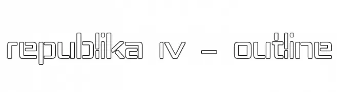
( Fonts by Apostrophic Lab )
A geometric, outline font with a modern and futuristic style.
![Republika IV - Outline baixar fontes gratis]() Baixar 124 baixar@WebFont
Baixar 124 baixar@WebFont
Perguntas Frequentes – Novas Fontes
Qual é a nova fonte que todo mundo está usando?
As tendências mudam rápido, mas fontes sans-serif minimalistas e displays expressivas estão dominando. São perfeitas para conteúdo digital e identidade de marca moderna.
Quais são as cinco novas fontes populares?
As mais baixadas atualmente incluem Poppins, Roboto, Montserrat, Open Sans e Lato. Elas equilibram clareza e personalidade, ideais para marcas, editoriais e redes sociais.
Como testar antes de baixar?
Use o recurso de visualização: digite seu texto na página da fonte para testar peso, espaçamento e legibilidade em diferentes tamanhos. Quando estiver satisfeito, baixe o arquivo TTF/OTF.