Bem-vindo à seção Novas Fontes — onde você descobre os lançamentos mais recentes adicionados ao FFonts.net. Seja designer, desenvolvedor ou amante da tipografia, esta página ajuda você a acompanhar as novidades do design.
Cada nova fonte tem sua própria personalidade: de sans-serifs modernas e limpas a scripts expressivas e displays ousadas. Atualizamos esta lista frequentemente para que você possa visualizar e baixar gratuitamente as últimas criações.
-
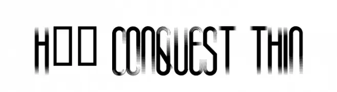
( Fonts by www.legacyofdefeat.com )
A modern, elongated font with thin strokes and tight spacing.
 Baixar 430 baixar@WebFont
 -
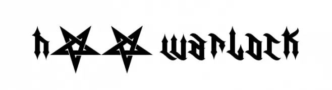
( Fonts by www.legacyofdefeat.com )
A bold, gothic blackletter font with sharp, angular lines and intricate detailing.
![H74 Warlock baixar fontes gratis]() Baixar 580 baixar@WebFont
Baixar 580 baixar@WebFont -
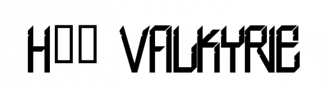
( Fonts by www.legacyofdefeat.com )
A bold, angular font with a futuristic and industrial design.
![H74 Valkyrie baixar fontes gratis]() Baixar 338 baixar@WebFont
Baixar 338 baixar@WebFont -
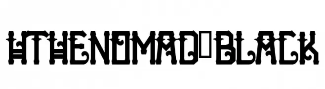
( Fonts by www.legacyofdefeat.com )
A bold, decorative font with gothic influences and intricate details.
![HTheNomad-Black baixar fontes gratis]() Baixar 206 baixar@WebFont
Baixar 206 baixar@WebFont -
( Fonts by www.legacyofdefeat.com )
A bold, three-dimensional font with strong shadow effects and geometric design.
![HTheNomad-Heavy baixar fontes gratis]() Baixar 112 baixar@WebFont
Baixar 112 baixar@WebFont -
-
( Fonts by www.legacyofdefeat.com )
A bold, three-dimensional font with a vintage, geometric style and strong shadow effects.
![H74 The Nomad Heavy baixar fontes gratis]() Baixar 319 baixar@WebFont
Baixar 319 baixar@WebFont -
( Fonts by www.legacyofdefeat.com )
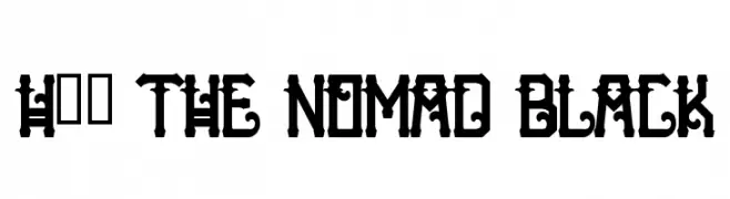
A bold, decorative font with intricate details and vintage flair.
![H74 The Nomad Black baixar fontes gratis]() Baixar 581 baixar@WebFont
Baixar 581 baixar@WebFont -
( Fonts by www.legacyofdefeat.com )
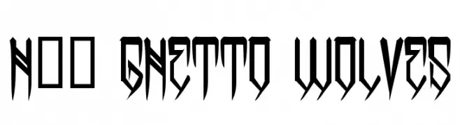
A bold, angular font with an urban, edgy style.
![H74 Ghetto Wolves baixar fontes gratis]() Baixar 1286 baixar@WebFont
Baixar 1286 baixar@WebFont -
![Ripple Font baixar fontes gratis]() Baixar 370 baixar@WebFont
Baixar 370 baixar@WebFont -
( Fonts by Yumi Manabe - sba-factory.com )
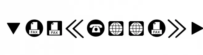
Bold, geometric icons ideal for user interfaces.
![ForButtons baixar fontes gratis]() Baixar 107 baixar@WebFont
Baixar 107 baixar@WebFont


Perguntas Frequentes – Novas Fontes
Qual é a nova fonte que todo mundo está usando?
As tendências mudam rápido, mas fontes sans-serif minimalistas e displays expressivas estão dominando. São perfeitas para conteúdo digital e identidade de marca moderna.
Quais são as cinco novas fontes populares?
As mais baixadas atualmente incluem Poppins, Roboto, Montserrat, Open Sans e Lato. Elas equilibram clareza e personalidade, ideais para marcas, editoriais e redes sociais.
Como testar antes de baixar?
Use o recurso de visualização: digite seu texto na página da fonte para testar peso, espaçamento e legibilidade em diferentes tamanhos. Quando estiver satisfeito, baixe o arquivo TTF/OTF.