Bem-vindo à seção Novas Fontes — onde você descobre os lançamentos mais recentes adicionados ao FFonts.net. Seja designer, desenvolvedor ou amante da tipografia, esta página ajuda você a acompanhar as novidades do design.
Cada nova fonte tem sua própria personalidade: de sans-serifs modernas e limpas a scripts expressivas e displays ousadas. Atualizamos esta lista frequentemente para que você possa visualizar e baixar gratuitamente as últimas criações.
-
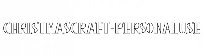
( Fonts by Letterafa Studio - Ahmad Afandi - Personal-use only. For commercial use please contact owner. )
A decorative font with geometric, elongated letterforms and high contrast strokes.
 Baixar 43 baixar@WebFont
 -
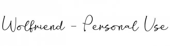
( Fonts by Letterafa Studio - Ahmad Afandi - Personal-use only. For commercial use please contact owner. )
A playful handwritten font with a casual elegance and modern appeal.
![Wolfriend - Personal Use baixar fontes gratis]() Baixar 68 baixar@WebFont
Baixar 68 baixar@WebFont -
( Fonts by Letterafa Studio - Ahmad Afandi - Personal-use only. For commercial use please contact owner. )
A playful, bold, and hand-drawn font with rounded edges and a friendly feel.
![We Love Mom - Personal Use Only baixar fontes gratis]() Baixar 205 baixar@WebFont
Baixar 205 baixar@WebFont -
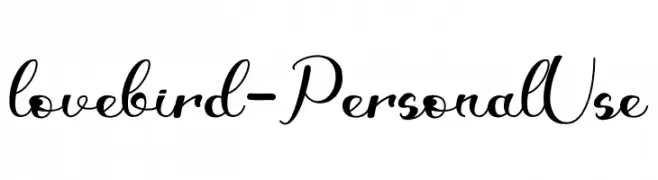
( Fonts by Letterafa Studio - Ahmad Afandi - Personal-use only. For commercial use please contact owner. )
A graceful and elegant script font with flowing, cursive letters.
![lovebird - Personal Use baixar fontes gratis]() Baixar 49 baixar@WebFont
Baixar 49 baixar@WebFont -
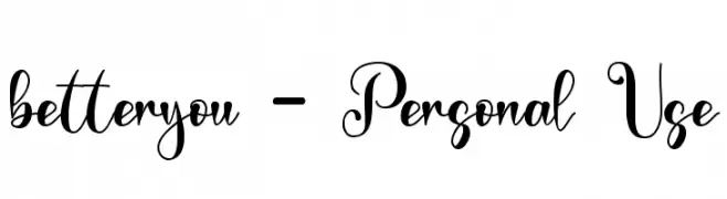
( Fonts by Letterafa Studio - Ahmad Afandi - Personal-use only. For commercial use please contact owner. )
A decorative script font with elegant swirls and playful loops.
![betteryou - Personal Use baixar fontes gratis]() Baixar 77 baixar@WebFont
Baixar 77 baixar@WebFont -
( Fonts by Letterafa Studio - Ahmad Afandi - Personal-use only. For commercial use please contact owner. )
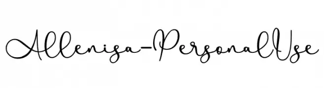
A playful and elegant handwritten script font with fluid, interconnected strokes.
![Allenisa - Personal Use baixar fontes gratis]() Baixar 70 baixar@WebFont
Baixar 70 baixar@WebFont -
( Fonts by Letterafa Studio - Ahmad Afandi - Personal-use only. For commercial use please contact owner. )
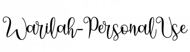
An elegant, flowing script font with intricate loops and swashes.
![Warilah - Personal Use baixar fontes gratis]() Baixar 36 baixar@WebFont
Baixar 36 baixar@WebFont -
( Fonts by Letterafa Studio - Ahmad Afandi - Personal-use only. For commercial use please contact owner. )
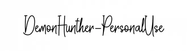
A playful, hand-drawn font with tall, narrow characters and a whimsical style.
![Demon Hunther - Personal Use baixar fontes gratis]() Baixar 42 baixar@WebFont
Baixar 42 baixar@WebFont -
( Fonts by Letterafa Studio - Ahmad Afandi - Personal-use only. For commercial use please contact owner. )
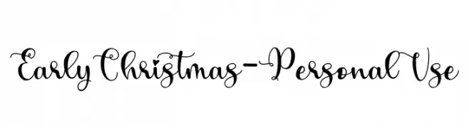
A whimsical and ornate script font with decorative swirls and playful accents.
![Early Christmas - Personal Use baixar fontes gratis]() Baixar 81 baixar@WebFont
Baixar 81 baixar@WebFont -
( Fonts by Letterafa Studio - Ahmad Afandi - Personal-use only. For commercial use please contact owner. )
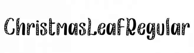
A festive, leaf-patterned font with bold, rounded strokes and a playful style.
![Christmas Leaf Regular baixar fontes gratis]() Baixar 45 baixar@WebFont
Baixar 45 baixar@WebFont -
( Fonts by Letterafa Studio - Ahmad Afandi - Personal-use only. For commercial use please contact owner. )
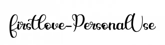
A playful and elegant script font with a handwritten feel.
![firstlove - Personal Use baixar fontes gratis]() Baixar 50 baixar@WebFont
Baixar 50 baixar@WebFont -
( Fonts by Letterafa Studio - Ahmad Afandi - Personal-use only. For commercial use please contact owner. )
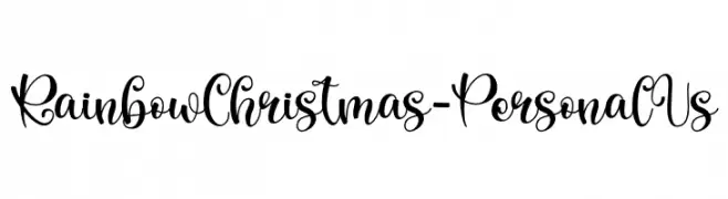
A whimsical, cursive script font with decorative swirls and loops.
![Rainbow Christmas - Personal Us baixar fontes gratis]() Baixar 53 baixar@WebFont
Baixar 53 baixar@WebFont -
( Fonts by Letterafa Studio - Ahmad Afandi - Personal-use only. For commercial use please contact owner. )
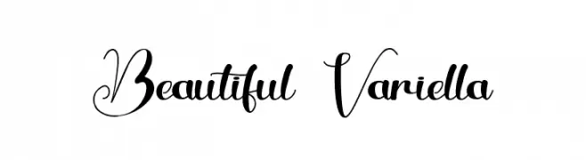
An elegant and decorative script font with intricate swirls and flourishes.
![Beautiful Variella baixar fontes gratis]() Baixar 75 baixar@WebFont
Baixar 75 baixar@WebFont -
( Fonts by Letterafa Studio - Ahmad Afandi - Personal-use only. For commercial use please contact owner. )
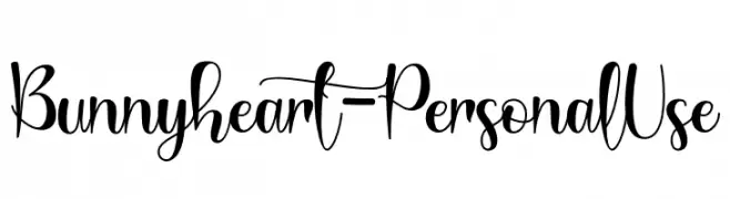
A playful, handwritten script font with dynamic strokes.
![Bunnyheart - Personal Use baixar fontes gratis]() Baixar 59 baixar@WebFont
Baixar 59 baixar@WebFont -
( Fonts by Letterafa Studio - Ahmad Afandi - Personal-use only. For commercial use please contact owner. )
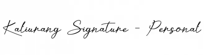
A fluid and graceful script font with a handwritten signature style.
![Kaliurang Signature - Personal baixar fontes gratis]() Baixar 91 baixar@WebFont
Baixar 91 baixar@WebFont -
( Fonts by Letterafa Studio - Ahmad Afandi - Personal-use only. For commercial use please contact owner. )
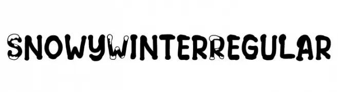
A playful, snowy-themed decorative font with bold, rounded characters.
![Snowy Winter Regular baixar fontes gratis]() Baixar 57 baixar@WebFont
Baixar 57 baixar@WebFont -
( Fonts by Letterafa Studio - Ahmad Afandi - Personal-use only. For commercial use please contact owner. )
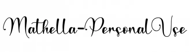
An elegant and flowing script font with ornate uppercase letters and harmonious lowercase characters.
![Mathella - Personal Use baixar fontes gratis]() Baixar 46 baixar@WebFont
Baixar 46 baixar@WebFont -
( Fonts by Letterafa Studio - Ahmad Afandi - Personal-use only. For commercial use please contact owner. )
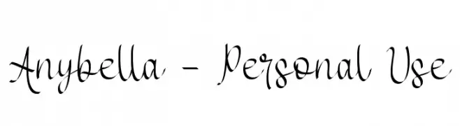
An elegant, flowing script font with sophisticated cursive letterforms.
![Anybella - Personal Use baixar fontes gratis]() Baixar 37 baixar@WebFont
Baixar 37 baixar@WebFont -
( Fonts by Letterafa Studio - Ahmad Afandi - Personal-use only. For commercial use please contact owner. )
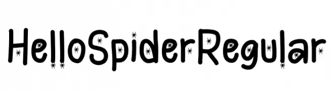
A playful, spider-themed font with bold, rounded letters and a whimsical style.
![Hello Spider Regular baixar fontes gratis]() Baixar 48 baixar@WebFont
Baixar 48 baixar@WebFont -
( Fonts by Letterafa Studio - Ahmad Afandi - Personal-use only. For commercial use please contact owner. )
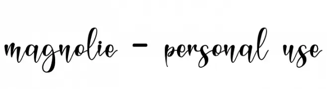
A lively, expressive script font with flowing cursive letterforms and medium contrast.
![magnolie - personal use baixar fontes gratis]() Baixar 54 baixar@WebFont
Baixar 54 baixar@WebFont -
( Fonts by Letterafa Studio - Ahmad Afandi - Personal-use only. For commercial use please contact owner. )
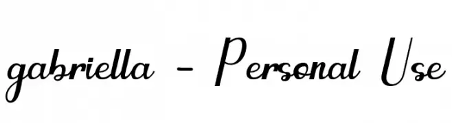
A modern, elegant font with angular uppercase and cursive lowercase letters.
![gabriella - Personal Use baixar fontes gratis]() Baixar 77 baixar@WebFont
Baixar 77 baixar@WebFont -
( Fonts by Letterafa Studio - Ahmad Afandi - Personal-use only. For commercial use please contact owner. )
A playful monoline font with flowing, interconnected strokes.
![Halloween Monoline - Personal U baixar fontes gratis]() Baixar 89 baixar@WebFont
Baixar 89 baixar@WebFont -
( Fonts by Letterafa Studio - Ahmad Afandi - Personal-use only. For commercial use please contact owner. )
A spooky, cobweb-adorned font perfect for Halloween themes.
![Halloween witches Regular baixar fontes gratis]() Baixar 47 baixar@WebFont
Baixar 47 baixar@WebFont -
( Fonts by Letterafa Studio - Ahmad Afandi - Personal-use only. For commercial use please contact owner. )
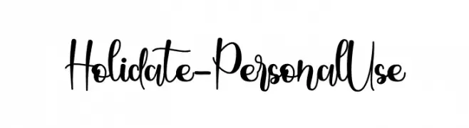
A playful, whimsical script font with a hand-drawn appearance.
![Holidate - Personal Use baixar fontes gratis]() Baixar 50 baixar@WebFont
Baixar 50 baixar@WebFont -
( Fonts by Letterafa Studio - Ahmad Afandi - Personal-use only. For commercial use please contact owner. )
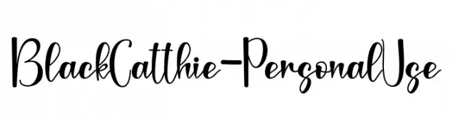
A playful, handwritten font with dynamic curves and decorative elements.
![Black Catthie - Personal Use baixar fontes gratis]() Baixar 44 baixar@WebFont
Baixar 44 baixar@WebFont -
( Fonts by Letterafa Studio - Ahmad Afandi - Personal-use only. For commercial use please contact owner. )
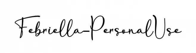
A playful and elegant script font with flowing cursive letters.
![Febriella - Personal Use baixar fontes gratis]() Baixar 82 baixar@WebFont
Baixar 82 baixar@WebFont -
( Fonts by Letterafa Studio - Ahmad Afandi - Personal-use only. For commercial use please contact owner. )
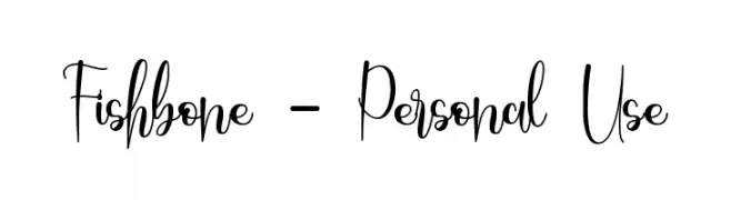
A whimsical and elegant script font with playful loops and flourishes.
![Fishbone - Personal Use baixar fontes gratis]() Baixar 58 baixar@WebFont
Baixar 58 baixar@WebFont -
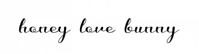
( Fonts by Letterafa Studio - Ahmad Afandi - Personal-use only. For commercial use please contact owner. )
An elegant and flowing script font with graceful, cursive letterforms.
![honey love bunny baixar fontes gratis]() Baixar 71 baixar@WebFont
Baixar 71 baixar@WebFont -
( Fonts by Letterafa Studio - Ahmad Afandi - Personal-use only. For commercial use please contact owner. )
A decorative cursive font with elegant loops and swirls.
![Agathis baixar fontes gratis]() Baixar 76 baixar@WebFont
Baixar 76 baixar@WebFont -
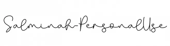
( Fonts by Letterafa Studio - Ahmad Afandi - Personal-use only. For commercial use please contact owner. )
A playful, whimsical handwritten font with fluid strokes and a personal touch.
![Salminah - Personal Use baixar fontes gratis]() Baixar 53 baixar@WebFont
Baixar 53 baixar@WebFont -
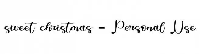
( Fonts by Letterafa Studio - Ahmad Afandi - Personal-use only. For commercial use please contact owner. )
A playful and elegant script font with a modern, handwritten style.
![sweet christmas - Personal Use baixar fontes gratis]() Baixar 47 baixar@WebFont
Baixar 47 baixar@WebFont -
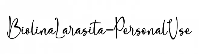
( Fonts by Letterafa Studio - Ahmad Afandi - Personal-use only. For commercial use please contact owner. )
A playful and elegant handwritten font with decorative loops and smooth curves.
![Biolina Larasita - Personal Use baixar fontes gratis]() Baixar 66 baixar@WebFont
Baixar 66 baixar@WebFont -
( Fonts by Letterafa Studio - Ahmad Afandi - Personal-use only. For commercial use please contact owner. )
A playful, handwritten font with smooth, fluid strokes and a dynamic appearance.
![Motherblood - Personal Use baixar fontes gratis]() Baixar 51 baixar@WebFont
Baixar 51 baixar@WebFont -
( Fonts by Letterafa Studio - Ahmad Afandi - Personal-use only. For commercial use please contact owner. )
A dynamic and flowing script font with elegant, fluid letterforms.
![Rabitta - Personal Use baixar fontes gratis]() Baixar 58 baixar@WebFont
Baixar 58 baixar@WebFont -
( Fonts by Letterafa Studio - Ahmad Afandi - Personal-use only. For commercial use please contact owner. )
A playful handwritten font with fluid, artistic letterforms.
![South Town baixar fontes gratis]() Baixar 51 baixar@WebFont
Baixar 51 baixar@WebFont


Perguntas Frequentes – Novas Fontes
Qual é a nova fonte que todo mundo está usando?
As tendências mudam rápido, mas fontes sans-serif minimalistas e displays expressivas estão dominando. São perfeitas para conteúdo digital e identidade de marca moderna.
Quais são as cinco novas fontes populares?
As mais baixadas atualmente incluem Poppins, Roboto, Montserrat, Open Sans e Lato. Elas equilibram clareza e personalidade, ideais para marcas, editoriais e redes sociais.
Como testar antes de baixar?
Use o recurso de visualização: digite seu texto na página da fonte para testar peso, espaçamento e legibilidade em diferentes tamanhos. Quando estiver satisfeito, baixe o arquivo TTF/OTF.